There is a difference between a logo you like and a logo that works. The first is a matter of taste. The second is a matter of decisions — and those decisions are exactly what separates professional design from a pretty picture.
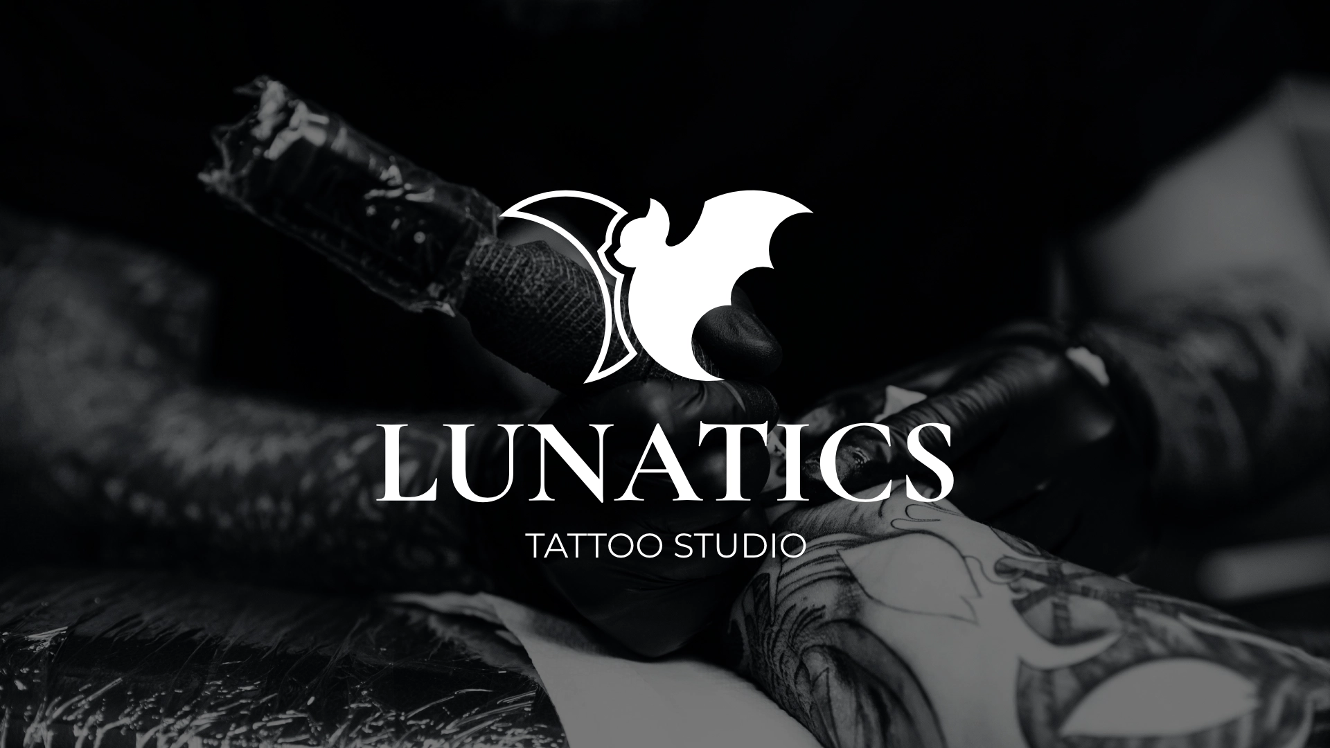
In this article I go through the eight criteria a logo is judged by, illustrating each one with a real project from the studio — the visual identity of Lunatics Tattoo Studio.
01Meaning comes before form
The most common mistake when commissioning a logo is asking “what picture should we use”. The right question is “what should it mean”.
With Lunatics, the concept came before every sketch. The name derives from the Latin lunaticus — “of the Moon”, “moonstruck”. Historically, lunar phases were believed to influence the spirit and the mind. In this brand, however, the Moon does not stand for madness but for being spellbound by art — the state of total immersion in the creative process.
The bat in the mark was not chosen because “bats look dark”. It is the Kalong (Pteropus vampyrus), the largest fruit bat. In Polynesian tradition, one of the oldest tattooing tools was made from the shoulder blade of a flying fox. The very word “tattoo” comes from the Samoan tatau — “to strike”, the sound of that ancient tool.
The result: a mark backed by several thousand years of history, not by a stock-icon search.
02Recognisable as a silhouette
A good logo is recognised as a shape before the brain processes any detail. That is why the first test is always a black silhouette on a white background.
In the Lunatics mark, the moon and the bat are not two objects placed side by side — they are constructed so that the crescent's contour ends exactly where the wing begins. One shape, two readings.
03Scalable from 8 mm to 3 metres
A logo lives simultaneously as an Instagram icon and as vinyl on a shopfront. Designed only for screen, it breaks in print; designed only for large format, it turns into a blob at small sizes.
With Lunatics the same mark works on a business card — where its height is under a centimetre — and across the full branding of the studio's shopfront. That is not luck, but the result of controlled line weight and enough space between elements.
04It works in a single colour
Colour is the last layer, not the foundation. A logo must function fully in black and fully in white — for engraving, screen printing, fax, invoices, embossing, embroidery on textile.
The Lunatics identity is built on three tones:
Note that none of them carries informational weight on its own. If the studio needs the mark engraved into steel tomorrow, nothing is lost.
05Typography is part of the logo, not decoration
The choice of typeface carries as much meaning as the mark itself. In Lunatics there is a deliberate contrast between two voices:
Cormorant Garamond for the “LUNATICS” wordmark — a classical serif with fine, almost surgical strokes. The association is with the needle and with respect for history.
Montserrat for “TATTOO STUDIO” — a geometric sans that guarantees legibility and balances the classical spirit with a modern, clean look.
This is a standard and very reliable scheme: serif for character, sans for clarity. The dangerous alternative is a decorative typeface that looks dated within two years.
06Appropriate for the industry
A logo has to be legible to the audience it is meant for. A tattoo studio is neither a clinic nor a bar — it is a place where something irreversible happens, and the visual identity has to carry that weight.
So Lunatics is resolved as the crest of a closed community, not as a cheerful shop sign. The tone of voice follows the same logic: tattooing is described as “the Ritual of Ink”, not as a service.
07Longevity instead of trend
Gradients, long shadows, blurred shapes — every year has its own style that, three years later, dates a logo more precisely than a signature.
The Lunatics mark is built from geometry and negative space. No effect can go out of fashion, because there is no effect at all.
08Flexibility in a real system
A logo is rarely used in its full form. In 80% of cases only the mark is visible — in a round avatar, on a print, as a watermark.
That is why the Lunatics system is built in tiers: full logo with tagline, compact version for business cards, standalone mark for profile pictures and social media. Each tier is designed separately, not mechanically cropped out of the largest one.
Summary: the checklist
Your logo is good if:
- 01You have an explanation for the form that was not invented after the fact
- 02It is recognisable as a silhouette
- 03It works from 8 mm to several metres
- 04It functions fully in black and fully in white
- 05The typeface was chosen for meaning, not for taste
- 06It communicates the right industry to a stranger
- 07It will not look dated in three years
- 08It has versions for every real-world use
If you answered “no” to three or more of these points, the problem is probably not the logo but the missing process behind it.